About My Sound
A website platform for independent musicians and bands.
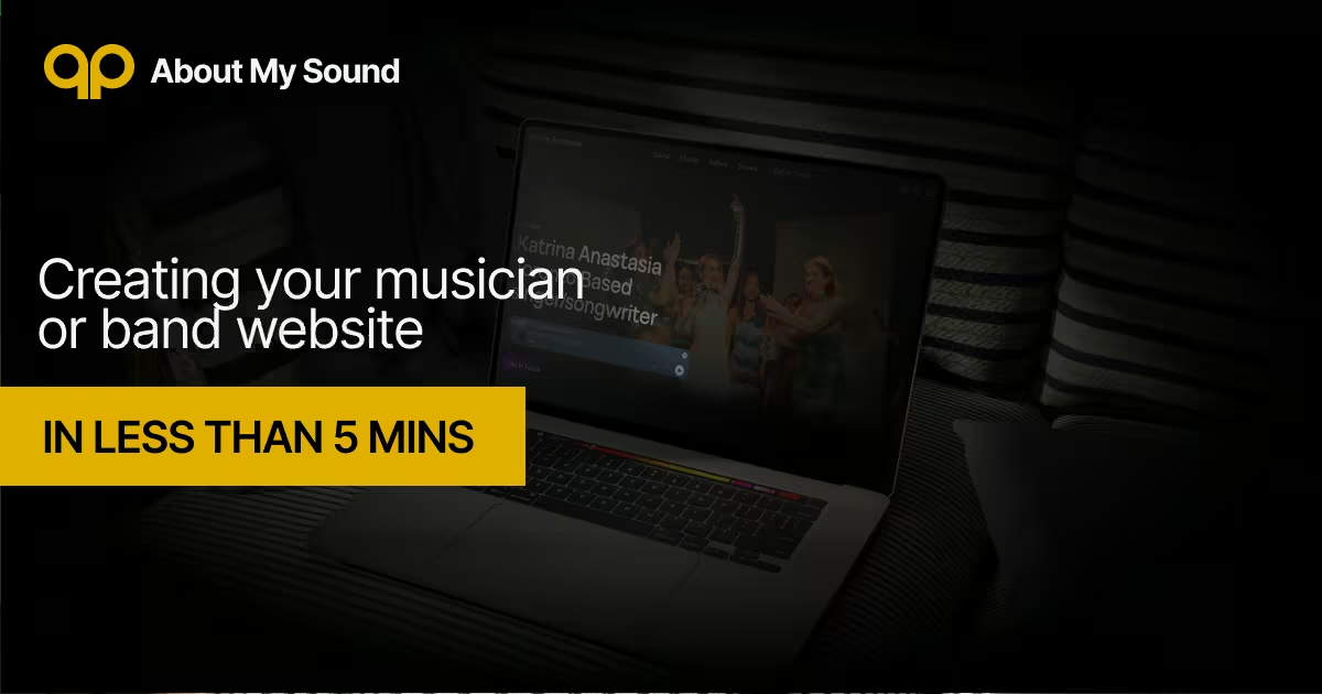
The core design philosophy behind the platform is freedom through constraint, intentionally limiting options to create true autonomy, focus, and creativity. Rather than focusing on component selection or design, the artist can focus on the quality of the content they upload.
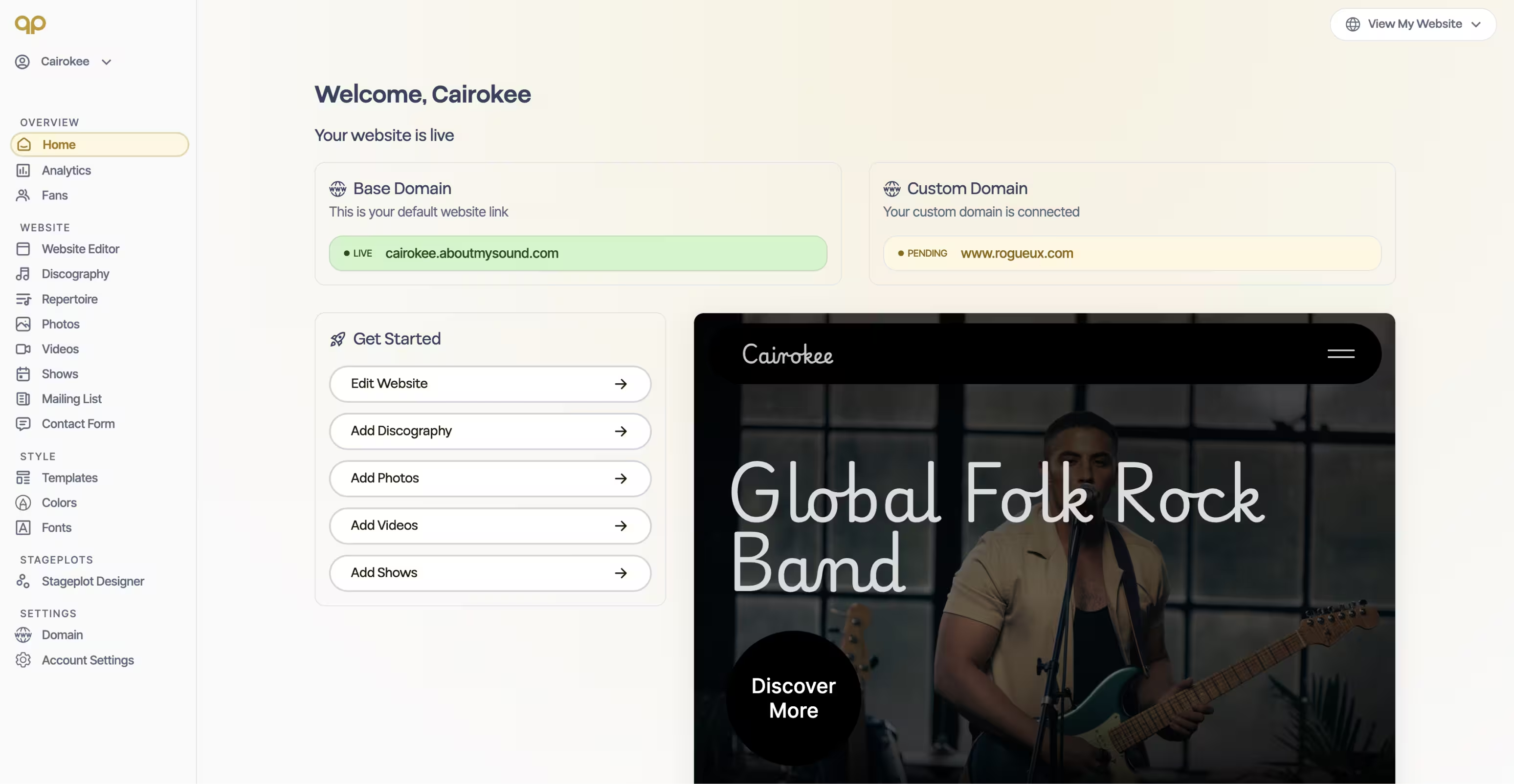
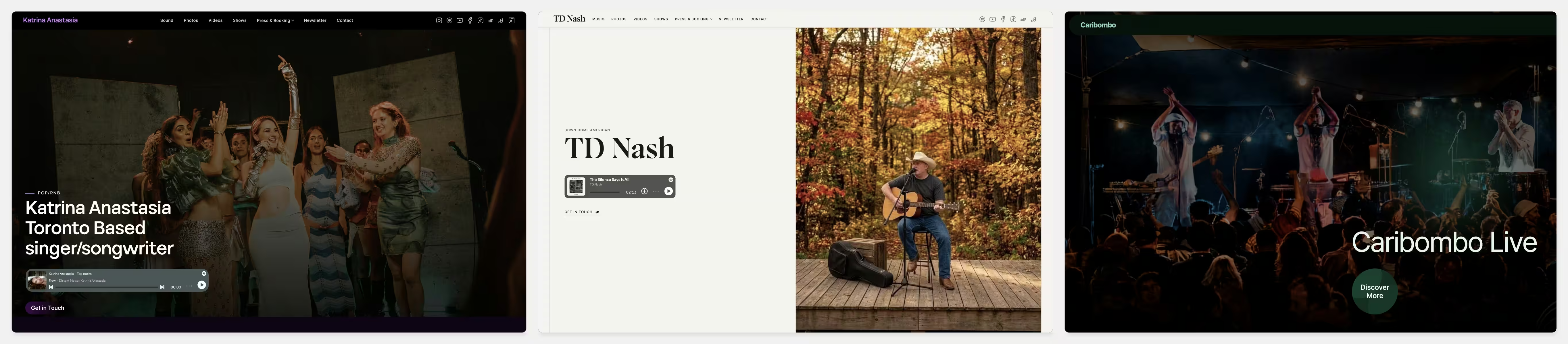
I designed and built About My Sound end to end: the product, the eight site templates, the dashboard, the rendering infrastructure and the billing. It went from zero to paying customers with no ad spend.
Role
Founder, product designer and engineer (solo)
Timeline
June 2025 to present
Stack
Figma, Webflow, vanilla JS, Cloudflare Workers, Pages, KV, Durable Objects, Analytics Engine, Xano, Stripe, Claude Code
Outcomes
- 280 signs ups and 16 paying subscribers - Sep 27, 2026
- 8 responsive templates run on one component system, so a single component edit reaches every artist site
- A free stage plot builder brings in qualified organic traffic and feeds straight into sign-up
- 2,400+ automated tests cover the rendering, billing and editor logic
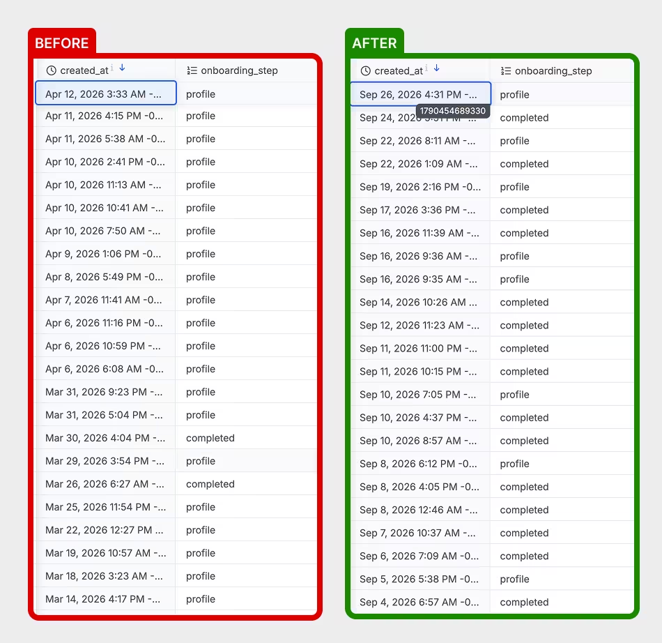
- Onboarding completion rose from ~20% to ~60% after I rebuilt the flow using session recordings and interviews
Testimonials
"About My Sound makes it so easy, prompting me to add all my information needed to build out my EPK effortlessly."
Katrina Anastasia - katrinaanastasia.aboutmysound.com
"Utilizing About My Sound’s platform to design a website for my band has been tremendously easy to work with."
In 2 Deep Band - in2deep.aboutmysound.com
"I appreciate how easy it is to use and how it creates a space for connection, creativity, and sharing music."
I'la Vibez - ilavibezmusic.com
How I work on this product
Development
I designed the marketing site and blog in Webflow, and built the platform with vanilla JS, Cloudflare Workers, Pages, KV, Durable Objects, Analytics Engine, Xano, Stripe, Claude Code.
I use Xano as the backend and connect Claude Code directly to it. This gives me a sandbox environment where I can review and test changes before pushing them to production.
My backend development process is:
- Create a detailed implementation plan
- Dispatch a separate coding agent to implement it
- Dispatch a review agent to QA the output
- Review the final result myself
- Push the changes from Xano sandbox to production
This lets me move quickly with AI-assisted development while keeping a human review step and clear guardrails around what reaches production.
User Research and Iterative Product Improvement
I built a continuous feedback loop into the product. I email new users to learn about their experience, schedule interviews, and use Microsoft Clarity to watch real sessions and identify where people get stuck.
When I find a problem, I trace it back to the root cause and ship the smallest change that removes the friction.
Many of the improvements below started with a single session recording of a frustrated artist.
1. Onboarding: 20% → 60% completion
The problem. Four out of five users who signed up never completed onboarding and abandoned the product before seeing their website.
Session recordings revealed a consistent pattern: people were getting stuck when onboarding asked for content they didn't have ready. Some were signing up on their phones without access to their press photos or bio. Others started on one device and returned on another.
The insight. Onboarding was asking users to do work before showing them value. A musician's first question is: What will my website look like?
What I changed. I redesigned onboarding around getting users to a finished-looking website as quickly as possible.
I removed plan selection, broke the flow into smaller steps, and made most information optional. Missing content now has considered fallbacks: an empty bio gets default copy, and a missing hero image gets stock imagery.
This means an artist can skip almost everything and still see a website that feels complete.
Result: onboarding completion increased from ~20% to ~60%.
2. Image cropping: show the whole photo
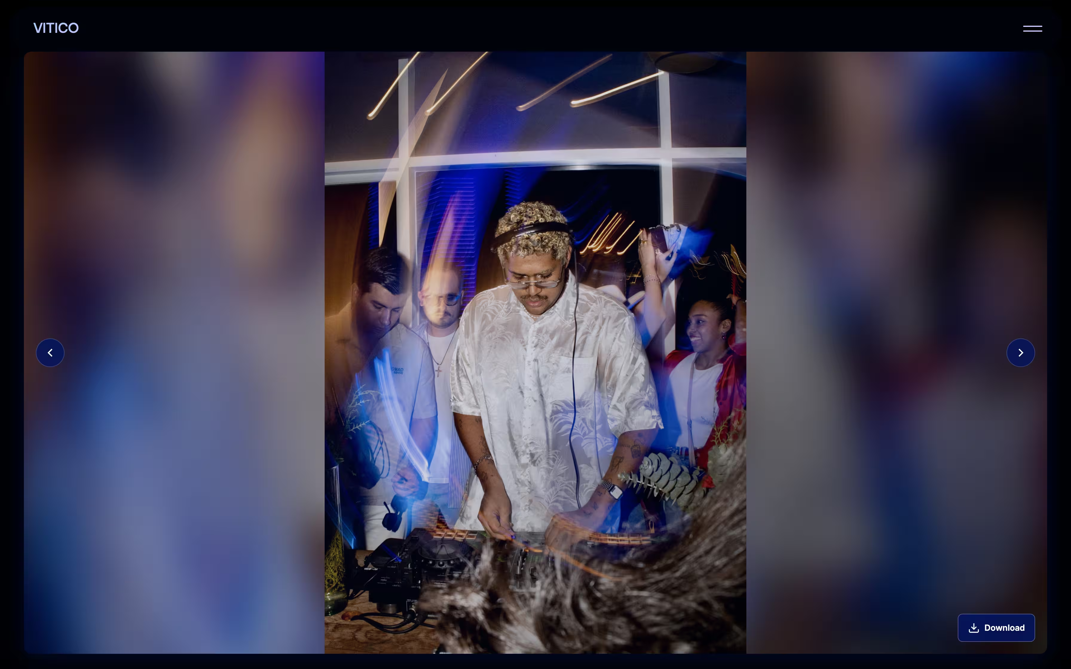
The problem. Artists told me their photo galleries were showing “only the torso.” Every image was forced into the same fixed frame and cropped from the centre.
The constraint. The ideal solution would have been to build image positioning controls. But that would add complexity and take time away from more important product problems, such as improving activation and sign-ups.
I wanted a solution that worked with images exactly as they were uploaded.
What I changed. I stopped cropping the images.
Each photo is displayed in full, with the surrounding space filled by a blurred and darkened version of the same image, similar to how Apple Music and Spotify handle album art.
Photos that naturally fit the frame look unchanged. Portraits, landscapes, and other aspect ratios remain fully visible without requiring the user to edit or reposition anything.
3. The website editor felt broken
The problem. Originally, the editing experience was divided into separate tabs: to edit the Hero section, you clicked “Hero”; to edit About, you clicked “About,” and so on.
Clarity recordings showed users scrolling, clicking around the page, and then closing the editor. They were treating the preview like a website, but the interface behaved more like a settings panel.
The insight. Users weren't doing anything wrong. Their mental model was simple: I want to change the thing I'm looking at.
The constraint. A fully visual, canvas-based website editor would have been a significant project. I needed to support the same mental model without taking on all of that complexity.
What I changed. I created a new Website Editor tab where users can scroll through their site and click directly on the element they want to edit.
Clicking an element opens the editing interface for that section. I built the new experience in staging first, allowing me to test the interaction without disrupting existing users.
[Image: Before/after GIF. Before: tab-based editing and dead clicks. After: scrollable website preview where clicking an element opens its editor.]
4. User acquisition: SEO + free products
The problem. About My Sound was a new product, and I needed to grow user acquisition without spending money on marketing.
I focused on two channels: SEO and free products that could introduce musicians to the platform.
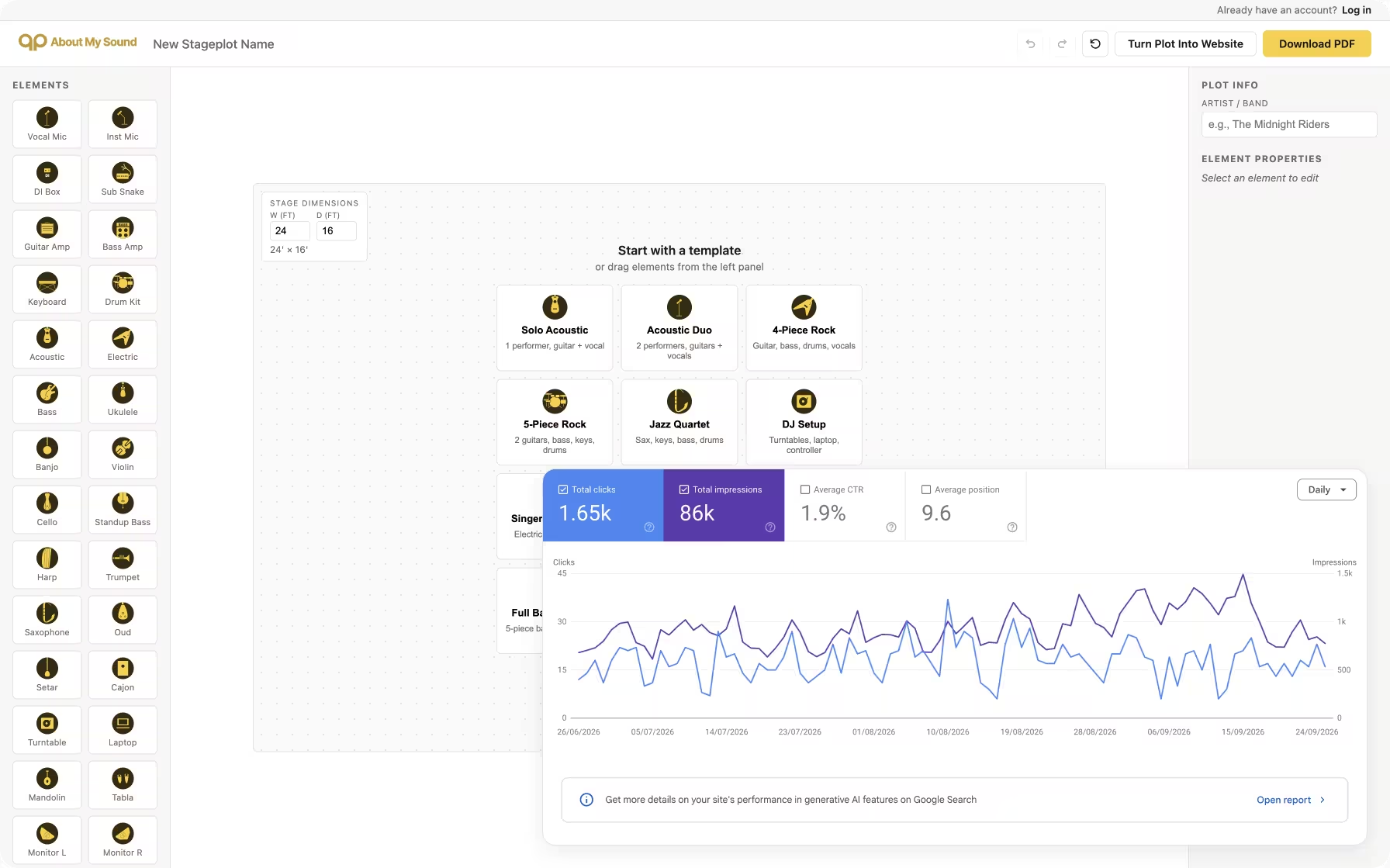
What I changed. I used Google Search Console data to reorganize the blog around content clusters that were already generating traffic.
I also noticed that stage plot tools were frequently discussed on Reddit, while many of the existing tools felt outdated. That led me to build a free Stage Plot Designer that lets musicians create and download professional stage plots as PDFs.
I built conversion paths into the tool that introduce users to About My Sound's website builder.
Result: Stage Plot Designer became my highest-performing source of traffic and conversions.
It also taught me an important lesson: relying heavily on one acquisition channel creates a point of failure. I'm now looking for additional ways to diversify how musicians discover the product.
What I'd do differently
I built About My Sound because I'm a musician and wanted to make something useful for our community.
Looking back, I would spend more time validating the market before building. In particular, I'd research total addressable market and willingness to pay much earlier.
Independent musicians have limited budgets, and I'm ultimately asking them to spend money in an already crowded wallet. That makes building sustainable revenue a longer road than I initially expected.
I'm now exploring a different distribution model: partnerships with music incubators and arts organizations, where the organization can fund websites for the artists they support.
That keeps the product focused on the same problem while changing who pays for it.