Discovery
Lightning talks, survey, 11 interviews
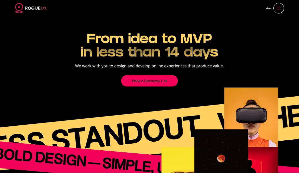
The design and development studio I founded during Covid.
Overview
The studio
During the pandemic, the physical world seemed to stop, and a lot of companies wanted to improve their online presence. I’d spent most of my career at design agencies, so I was used to reading RFPs and pitching clients. I designed a website for my own studio and tried my luck at winning corporate clients.
To be honest, I thought it was a long shot. I didn’t expect to beat established agencies on my own, with no team.
One of the biggest projects I won was the Endangered Languages Project. ELP received nearly three dozen proposals for its new website and Revitalization Helpdesk, and chose RogueUX for our “demonstrated experience in building engaging user communities, supporting multilingual websites, serving international audiences, rigorous UX testing and design, and doing it all at a competitive price point.” They went with our higher-end budget option: $108,000 USD.
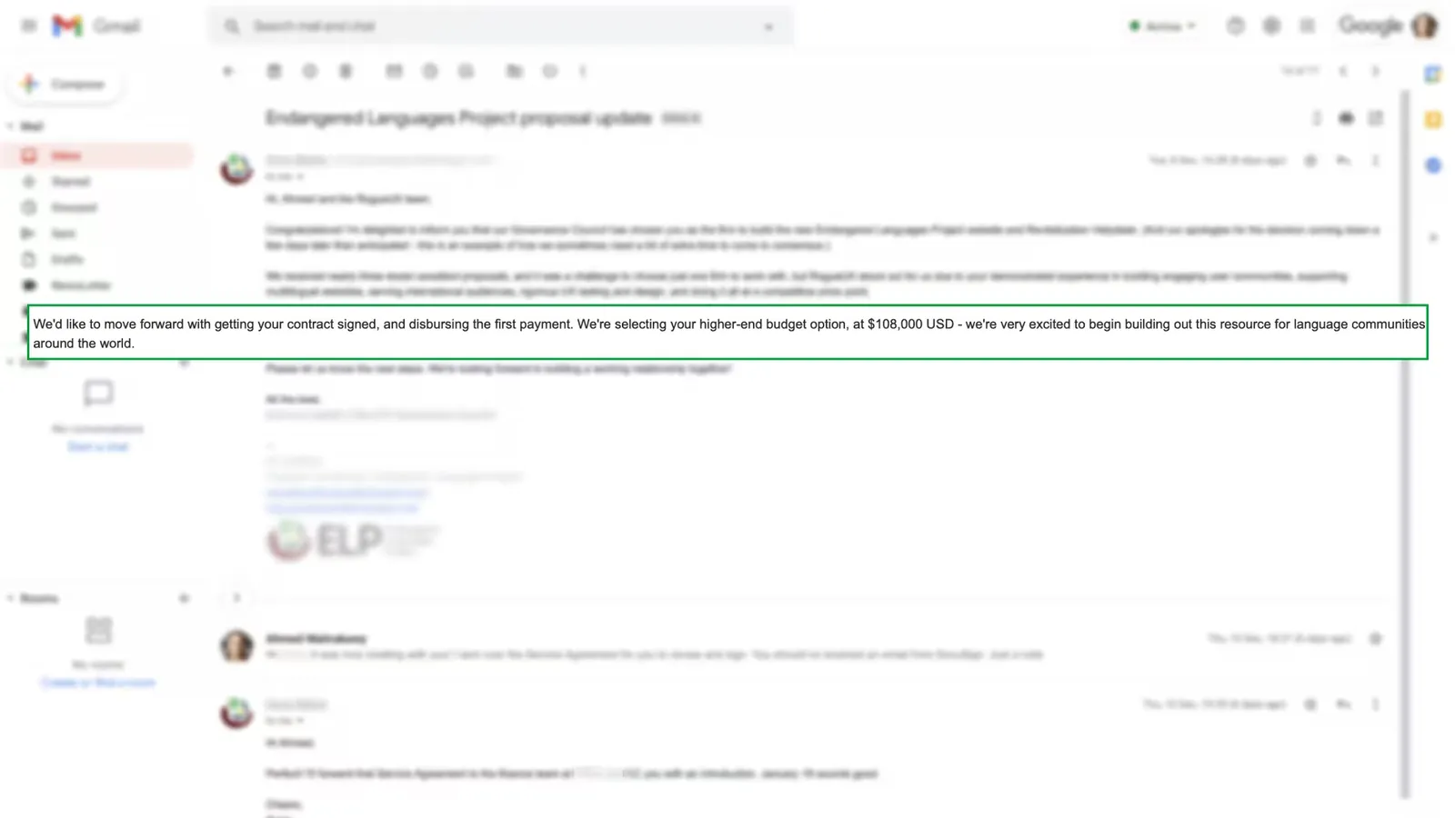
I got to work the same day. I hired two contractors, a junior product designer and a senior software engineer, and managed the client while leading design and product.
One platform for language communities and researchers
A digital presence for a newly established nonprofit
Client 01 · Endangered Languages Project
The Endangered Languages Project (ELP) needed one platform to serve two very different audiences.
Language communities needed a place to document and share their language (recordings, writing systems, oral histories and resources) and to connect with other people doing the same work. That side of the platform needed to feel personal, welcoming and low-friction. Community members aren’t filling out a database form; they’re contributing to something they care deeply about.
Researchers needed the opposite. They needed to browse verified data across hundreds of languages, understand how endangered each one was, compare languages, and trust where the information came from. That side needed to feel structured and rigorous.
The challenge was designing one experience that supported both cultural ownership and academic rigor, without feeling like two separate products stitched together.
We redesigned and rebuilt the platform on WordPress over eight months, then came back for a six-month v2.
My role
Anthony
ELP · The core problem
Both audiences met at the same artifact: the vitality score, shown on every language page.
A vitality score rates how at risk a language is of disappearing, based on factors like the number of speakers and whether the language is still passed down between generations. ELP’s admin team and community members both needed to enter this data through WordPress, and the score needed to surface clearly on each language’s public page.
That created two design problems at once:
It was the problem we kept coming back to, through v1 and into v2.
ELP · Research
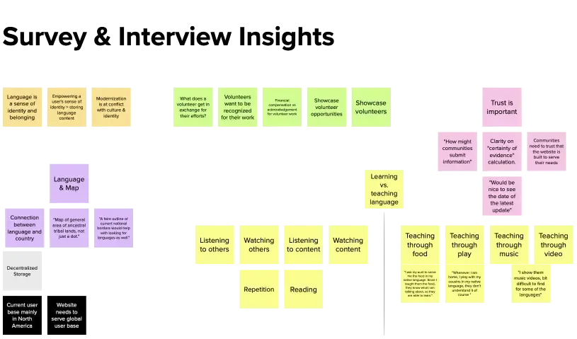
We kicked off with lightning talks and How Might We sessions with the ELP team, then sent a UX survey on Typeform to get to know users and stakeholders. After reviewing the results, we ran 5 stakeholder interviews and 6 user interviews over Zoom to understand both audiences directly.
The clearest tension to come out of the research: community members wanted to feel ownership and pride in their language’s page, something closer to a personal or cultural profile. Many didn’t necessarily trust outside researchers.
Researchers wanted provenance and structure: clear sourcing, comparability and confidence in the data.
Both needs had to be served by the same UI patterns. That shaped the platform’s visual language: informative, but friendly.
ELP · Process
Lightning talks, survey, 11 interviews
Personas, journeys, stories, card sorting
Wireframes, hi-fi, prototype, usability tests
Database, back end, front end
Admin training and handover docs
From the research we developed three personas to keep these different needs concrete throughout the design:
A member of an endangered language community. Motivated by pride and preservation; needs low-friction ways to contribute.
A language researcher. Motivated by data integrity; needs to browse, compare and trust sourcing.
A language preservation volunteer. Motivated by contribution; sits between the other two.
We mapped each persona’s journey with user flow diagrams, storyboards and journey maps. They helped us visualize the happy path through the product and spot the friction that needed to be addressed.
User stories then translated those needs into potential product functionality. ELP stakeholders, language researchers and designers were all guided to write as many user stories as they could think of. Anthony, the junior designer on my team, and I then cleaned them up and grouped related stories into epics. A card sorting workshop shaped the sitemap.
ELP · V1
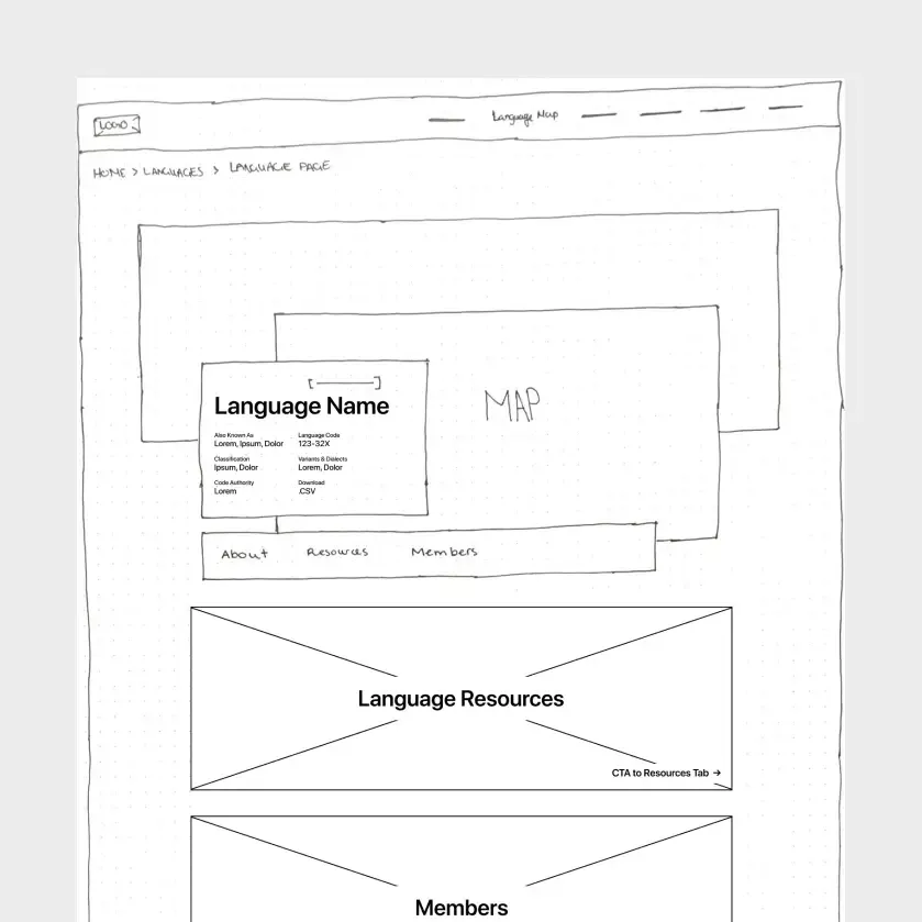
Each epic, such as “Language Page” or “Create a Language,” was translated into a set of wireframes and shared with the team and users for feedback.
Early wireframes tested a single, dense layout. Community reviewers said it felt too “form-like,” which was exactly what we were trying to avoid. We used that feedback to iterate, moving from hand-drawn wireframes to high-fidelity responsive screens and a live prototype in Webflow, which we put through usability testing before building it in WordPress.
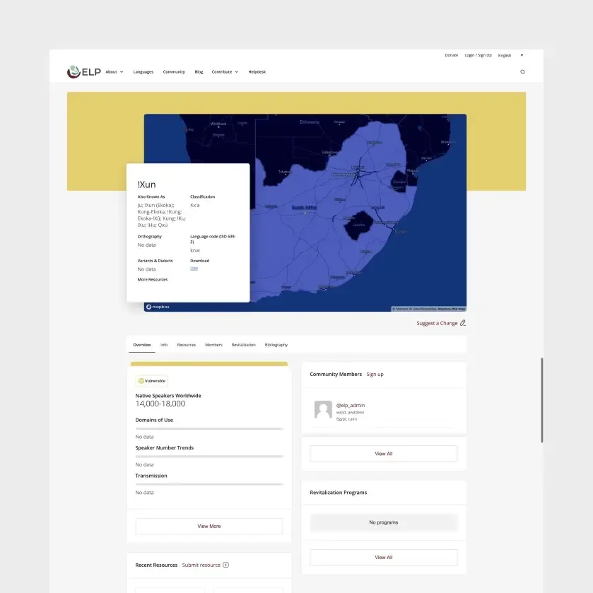
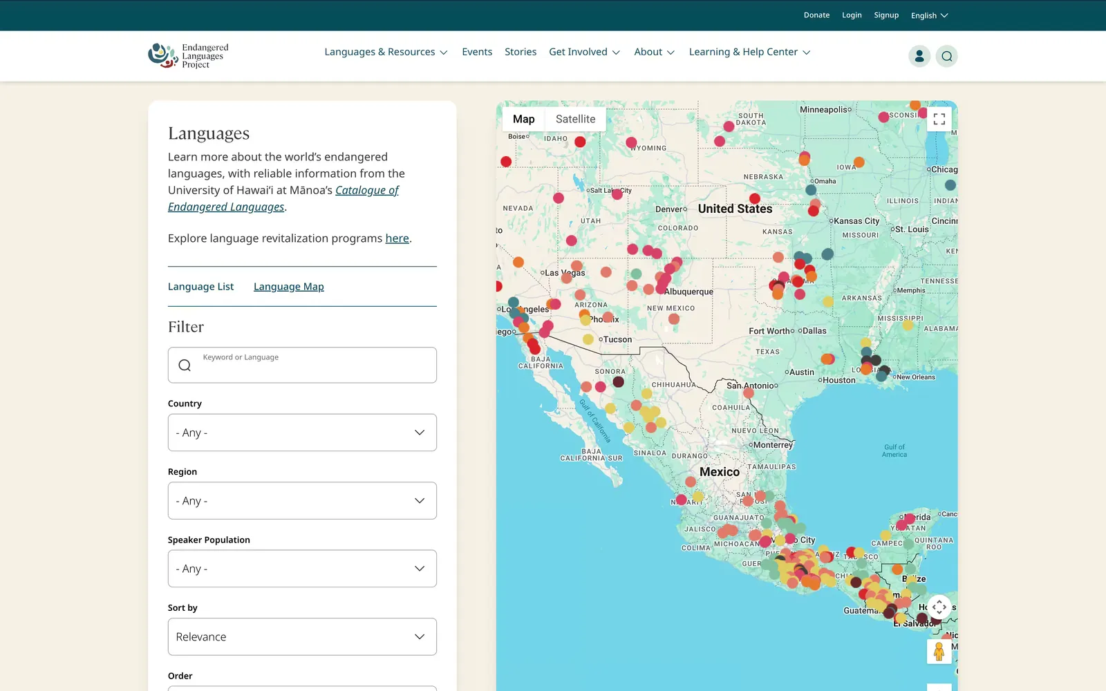
V1 was a full redesign and rebuild, from restructuring the resources database to integrating forums and translation management:
Browse languages by where they’re spoken
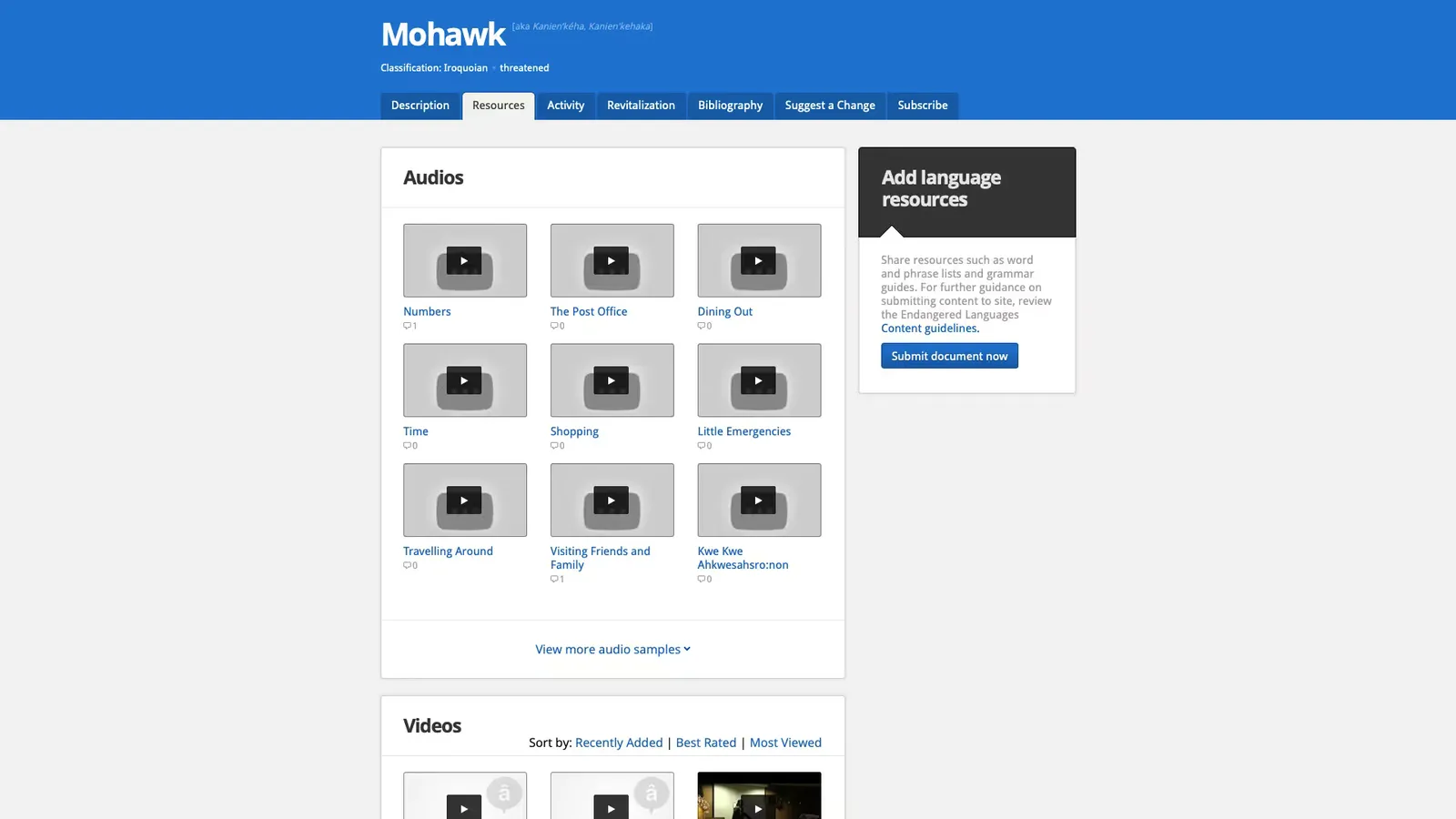
A page for each language, with its resources and data
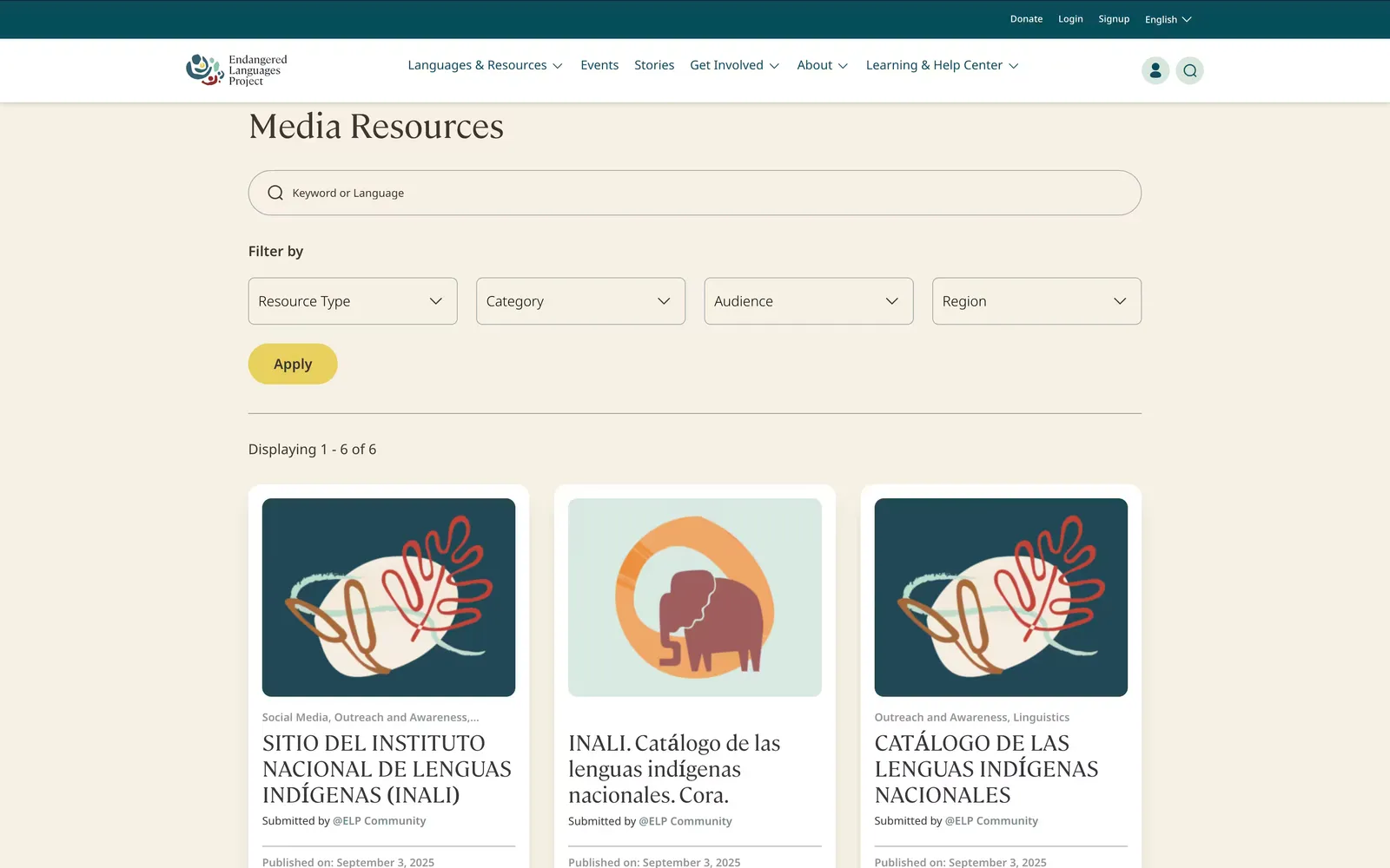
A restructured resources database, with search and filtering
A member directory and Discourse-powered forums
Translation management for publishing in other languages
So ELP’s team could run the platform themselves
ELP · V2 · Community
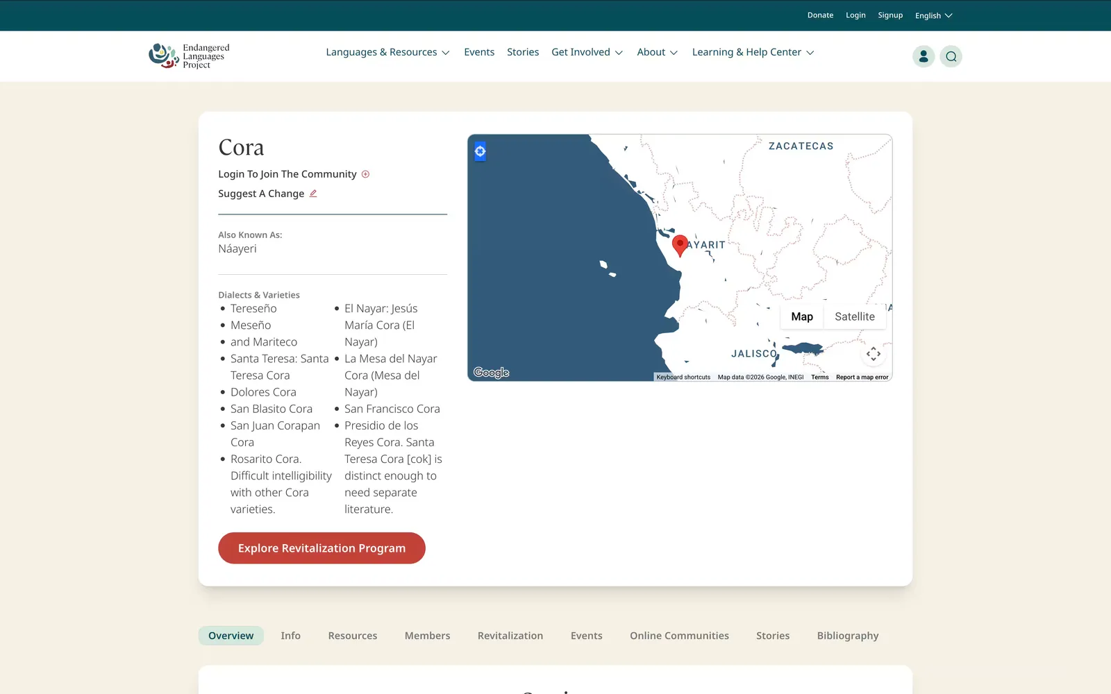
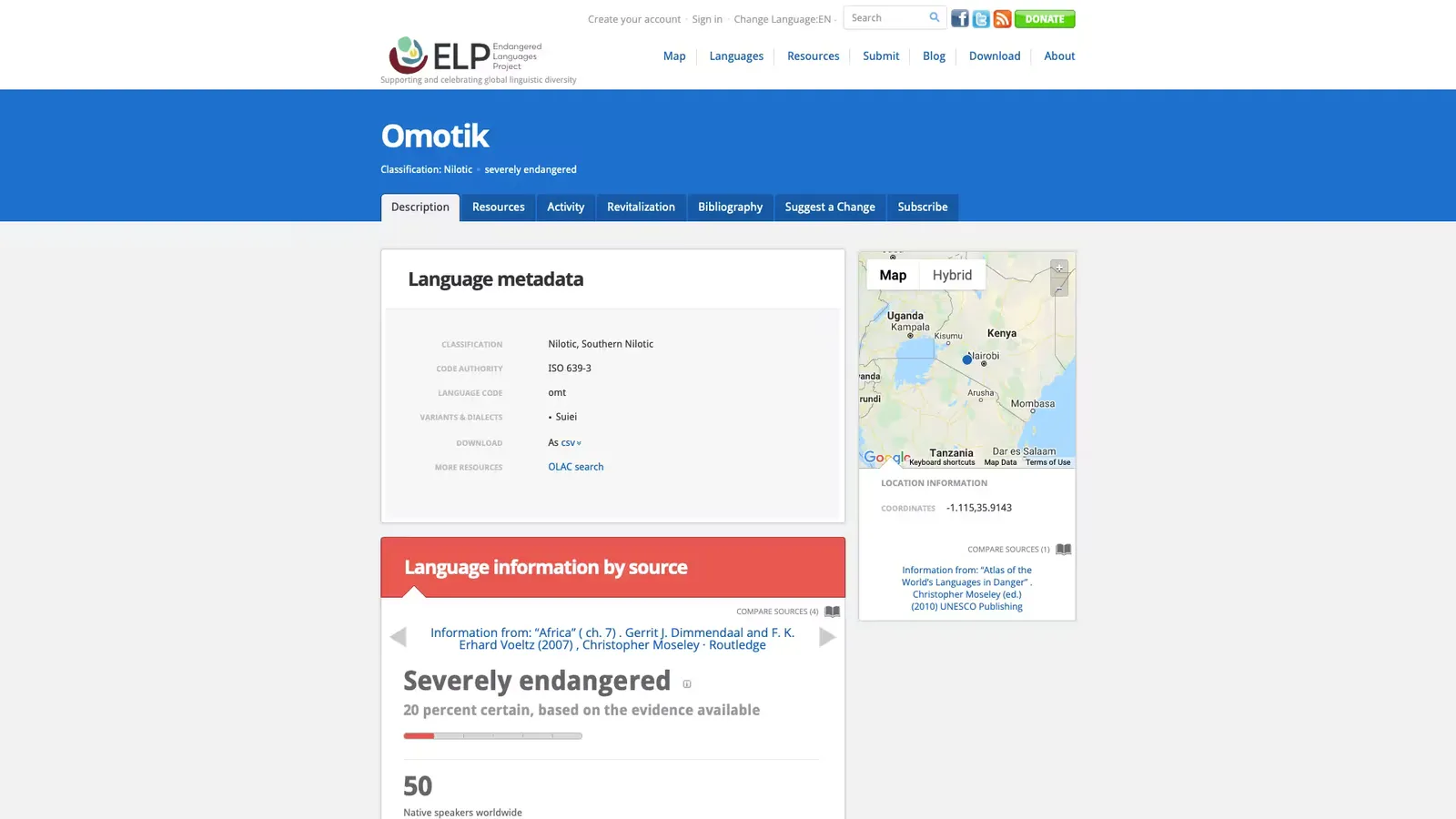
The language page originally read like a database entry: data first, with the endangerment level near the top. For v2, we redesigned it to be light and playful, so it felt less like a record in a catalogue and more like an online home for the community.
ELP · V2 · Research
Moving the data off the overview didn’t mean hiding it. V2 made it more rigorous.
A calculated score. Rather than showing raw data, vitality became a calculated score. Intergenerational transmission counts double:
The total is divided by the highest possible score for the factors that have data, then scaled to 100, so a language with gaps in its data isn’t penalized for them.
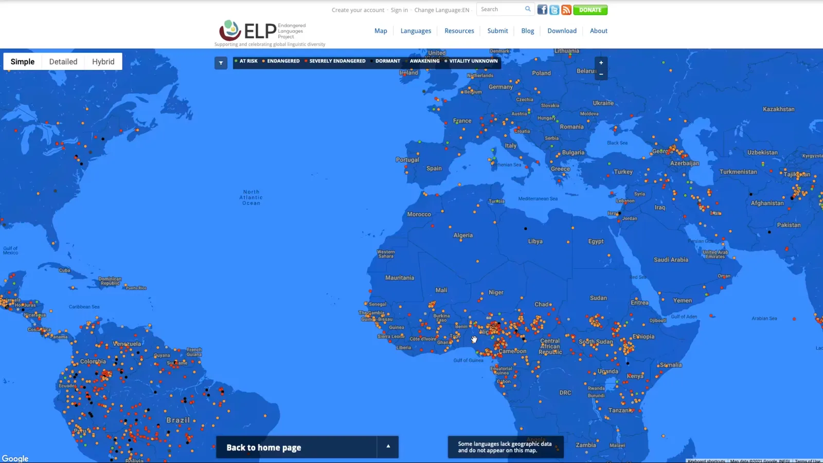
Seven levels on the map. The language map grouped vitality into seven levels (at risk, vulnerable, threatened, severely endangered, dormant, awakening and unknown), each with its own pin. Vitality can be toggled on or off, and a second toggle shows revitalization programs, so the map shows where communities are bringing languages back, not only where languages are declining.
Every data point cites its source. The Info tab labels each source “Information from: [citation],” linked whenever a URL exists, and makes room for longer bodies of text.
Contributions are reviewed. Community-submitted events and revitalization programs are saved as drafts for ELP’s admins to review and publish, so contributing stays easy without compromising the data.
The result was one page that served both audiences: an online home up front, with rigor one tab away.
ELP · Result
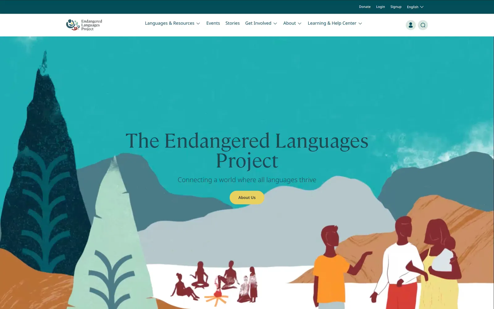
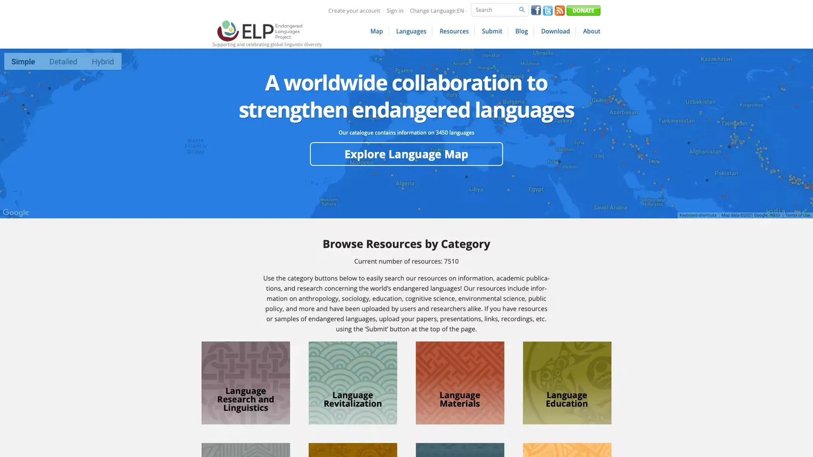
Drag across each screenshot to compare the original site with the platform we designed and built.
Client 02 · WKLIP
The West Kootenay Local Immigration Partnership (WKLIP) is a coalition of organizations working together to create more welcoming communities for newcomers across Nelson, Castlegar, Trail and the surrounding area.
As a newly established nonprofit, WKLIP needed more than a website. It needed a clear digital presence that explained who the organization was, communicated its role in the local community, and made its resources and programs easier to discover.
The challenge was to create an experience that felt welcoming and approachable to newcomers, while communicating the credibility needed to work with community organizations, service providers and other stakeholders.
WKLIP · Research
There are more than 200 Local Immigration Partnerships (LIPs) across Canada, which gave us a broad set of organizations to learn from.
WKLIP shared three websites they admired as a starting point. We expanded on that by reviewing 10+ LIP websites to see how organizations in the same space approached navigation, content hierarchy, accessibility and communication.
We looked for patterns in questions such as:
The research gave us a clear picture of the category, and showed an opportunity for WKLIP to establish its own identity.
WKLIP · Stakeholders
Because WKLIP was newly established, the website also needed to help clarify the organization’s role.
We worked with stakeholders to understand the audiences they needed to reach, the information they wanted to communicate, and the relationships between WKLIP, newcomers, community organizations and local service providers.
This helped us prioritize the site’s content and structure around four questions people actually needed answered:
That clarity became a key part of the design direction.
WKLIP · Design system
The visual system was designed to balance two qualities that can easily conflict: warmth and credibility.
The site needed to feel approachable to people who might already be navigating an unfamiliar community, while giving partner organizations confidence in WKLIP as a legitimate coalition.
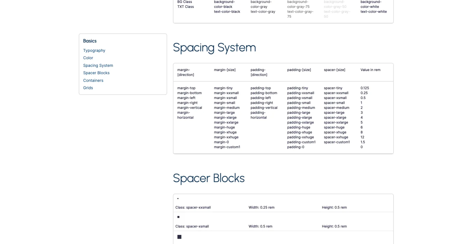
We built a flexible UI system covering typography, spacing, colour, buttons, content blocks, navigation and responsive layouts. It gave the site a consistent foundation, and kept every type of content, from organizational information to resources and community initiatives, easy to scan and understand.
We designed the prototype and UI system in Webflow, using reusable components and patterns to establish the visual language before development. That also made the design-to-development handoff clear, with little ambiguity about how the system should be implemented. For the final build, we implemented a custom WordPress theme based on the approved designs, so WKLIP could manage and update content on their own.
WKLIP · Result
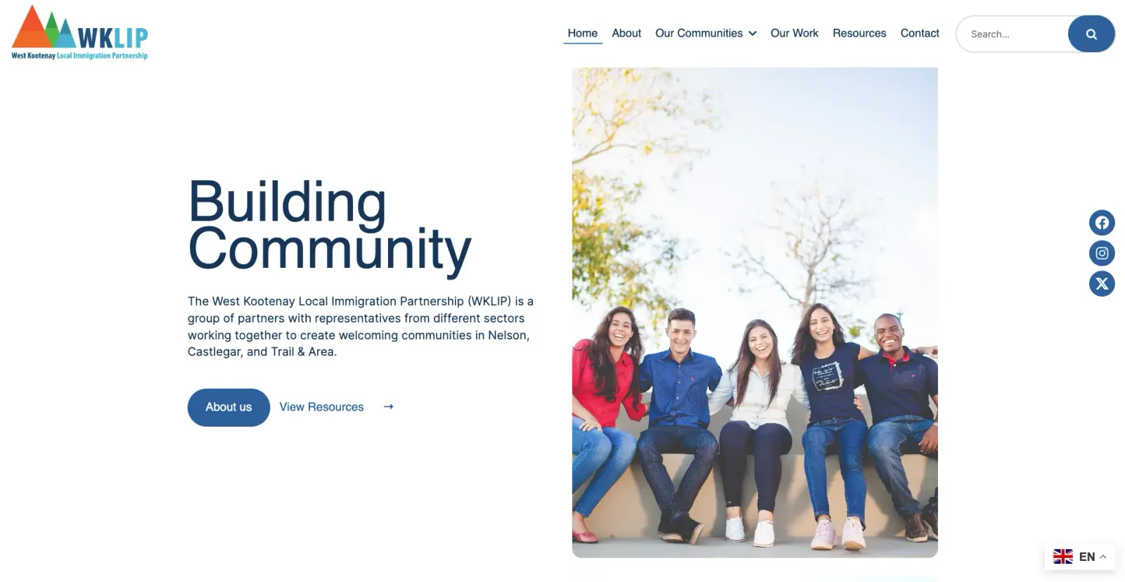
The final website gave WKLIP a professional digital foundation as it established itself in the West Kootenay region.
The organization is now easier to understand, its work easier to discover, and its digital presence better aligned with the welcoming communities it’s working to build. And because it’s built as a flexible WordPress site, it can grow alongside the organization as its programs, partnerships and community presence expand.
Next project